EntityType Field
A special ChoiceType field that’s designed to load options from a Doctrine
entity. For example, if you have a Category entity, you could use this
field to display a select field of all, or some, of the Category
objects from the database.
| Rendered as | can be various tags (see Select Tag, Checkboxes or Radio Buttons) |
| Options | |
| Overridden options | |
| Inherited options | from the ChoiceType:
from the FormType: |
| Parent type | ChoiceType |
| Class | EntityType |
Tip
The full list of options defined and inherited by this form type is available running this command in your app:
1 2 | # replace 'FooType' by the class name of your form type
$ php bin/console debug:form FooType
|
Basic Usage
The entity type has just one required option: the entity which should
be listed inside the choice field:
use App\Entity\User;
use Symfony\Bridge\Doctrine\Form\Type\EntityType;
// ...

$builder->add('users', EntityType::class, [
    // looks for choices from this entity
    'class' => User::class,

    // uses the User.username property as the visible option string
    'choice_label' => 'username',

    // used to render a select box, check boxes or radios
    // 'multiple' => true,
    // 'expanded' => true,
]);
This will build a select drop-down containing all of the User objects
in the database. To render radio buttons or checkboxes instead, change the
multiple and expanded options.
Using a Custom Query for the Entities
If you want to create a custom query to use when fetching the entities (e.g. you only want to return some entities, or need to order them), use the query_builder option:
use App\Entity\User;
use Doctrine\ORM\EntityRepository;
use Symfony\Bridge\Doctrine\Form\Type\EntityType;
// ...

$builder->add('users', EntityType::class, [
    'class' => User::class,
    'query_builder' => function (EntityRepository $er) {
        return $er->createQueryBuilder('u')
            ->orderBy('u.username', 'ASC');
    },
    'choice_label' => 'username',
]);
Note
Using form collections may result in making too many database requests to fetch related entities. This is known as the “N + 1 query problem” and it can be solved by joining related records when querying for Doctrine associations.
Using Choices
If you already have the exact collection of entities that you want to include
in the choice element, just pass them via the choices key.
For example, if you have a $group variable (passed into your form perhaps
as a form option) and getUsers() returns a collection of User entities,
then you can supply the choices option directly:
use App\Entity\User;
use Symfony\Bridge\Doctrine\Form\Type\EntityType;
// ...

$builder->add('users', EntityType::class, [
    'class' => User::class,
    'choices' => $group->getUsers(),
]);
Select Tag, Checkboxes or Radio Buttons
This field may be rendered as one of several HTML fields, depending
on the expanded and multiple options:
| Element Type | Expanded | Multiple |
|---|---|---|
| select tag | false |
false |
select tag (with multiple attribute) |
false |
true |
| radio buttons | true |
false |
| checkboxes | true |
true |
Field Options
choice_label
type: string, callable or PropertyPath
This is the property that should be used for displaying the entities as text in the HTML element:
use App\Entity\Category;
use Symfony\Bridge\Doctrine\Form\Type\EntityType;
// ...

$builder->add('category', EntityType::class, [
    'class' => Category::class,
    'choice_label' => 'displayName',
]);
If left blank, the entity object will be cast to a string and so must have a __toString()
method. You can also pass a callback function for more control:
use App\Entity\Category;
use Symfony\Bridge\Doctrine\Form\Type\EntityType;
// ...

$builder->add('category', EntityType::class, [
    'class' => Category::class,
    'choice_label' => function ($category) {
        return $category->getDisplayName();
    }
]);
The method is called for each entity in the list and passed to the function. For more details, see the main choice_label documentation.
Note
When passing a string, the choice_label option is a property path. So you
can use anything supported by the
PropertyAccessor component
For example, if the translations property is actually an associative
array of objects, each with a name property, then you could do this:
use App\Entity\Genre;
use Symfony\Bridge\Doctrine\Form\Type\EntityType;
// ...

$builder->add('genre', EntityType::class, [
    'class' => Genre::class,
    'choice_label' => 'translations[en].name',
]);
class
type: string required
The class of your entity (e.g. App:Category). This can be
a fully-qualified class name (e.g. App\Entity\Category)
or the short alias name (as shown prior).
em
type: string | Doctrine\Persistence\ObjectManager default: the default entity manager
If specified, this entity manager will be used to load the choices
instead of the default entity manager.
query_builder
type: Doctrine\ORM\QueryBuilder or a callable default: null
Allows you to create a custom query for your choices. See Using a Custom Query for the Entities for an example.
The value of this option can either be a QueryBuilder object, a callable or
null (which will load all entities). When using a callable, you will be
passed the EntityRepository of the entity as the only argument and should
return a QueryBuilder. Returning null in the Closure will result in
loading all entities.
Caution
The entity used in the FROM clause of the query_builder option
will always be validated against the class which you have specified at the
class option. If you return another entity instead of the
one used in your FROM clause (for instance if you return an entity
from a joined table), it will break validation.
Overridden Options
choice_name
type: callable, string or PropertyPath default: null
Controls the internal field name of the choice. You normally don’t care about this, but in some advanced cases, you might. For example, this “name” becomes the index of the choice views in the template and is used as part of the field name attribute.
This can be a callable or a property path. See choice_label for similar usage.
By default, the choice key or an incrementing integer may be used (starting at 0).
Tip
When defining a custom type, you should use the
ChoiceList class helper:
use Symfony\Component\Form\ChoiceList\ChoiceList;

// ...
$builder->add('choices', ChoiceType::class, [
    'choice_name' => ChoiceList::fieldName($this, 'name'),
]);
See the “choice_loader” option documentation.
Caution
The configured value must be a valid form name. Make sure to only return valid names when using a callable. Valid form names must be composed of letters, digits, underscores, dashes and colons and must not start with a dash or a colon.
In the EntityType, this defaults to the id of the entity, if it can
be read. Otherwise, it falls back to using auto-incrementing integers.
choice_value
type: callable, string or PropertyPath default: null
Returns the string “value” for each choice, which must be unique across all choices.
This is used in the value attribute in HTML and submitted in the POST/PUT requests.
You don’t normally need to worry about this, but it might be handy when processing
an API request (since you can configure the value that will be sent in the API request).
This can be a callable or a property path. By default, the choices are used if they
can be casted to strings. Otherwise an incrementing integer is used (starting at 0).
If you pass a callable, it will receive one argument: the choice itself. When using
the EntityType Field, the argument will be the entity object
for each choice or null in a placeholder is used, which you need to handle:
'choice_value' => function (?MyOptionEntity $entity) {
    return $entity ? $entity->getId() : '';
},
Tip
When defining a custom type, you should use the
ChoiceList class helper:
use Symfony\Component\Form\ChoiceList\ChoiceList;

// ...
$builder->add('choices', ChoiceType::class, [
    'choice_value' => ChoiceList::value($this, 'uuid'),
]);
See the “choice_loader” option documentation.
In the EntityType, this is overridden to use the id by default. When the
id is used, Doctrine only queries for the objects for the ids that were actually
submitted.
choices
type: array | \Traversable default: null
Instead of allowing the class and query_builder options to fetch the
entities to include for you, you can pass the choices option directly.
See Using Choices.
data_class
type: string default: null
This option is not used in favor of the class option which is required
to query the entities.
Inherited Options
These options inherit from the ChoiceType:
choice_attr
type: array, callable, string or PropertyPath default: []
Use this to add additional HTML attributes to each choice. This can be an associative array where the keys match the choice keys and the values are the attributes for each choice, a callable or a property path (just like choice_label).
If an array, the keys of the choices array must be used as keys:
use Symfony\Component\Form\Extension\Core\Type\ChoiceType;
// ...

$builder->add('attending', ChoiceType::class, [
    'choices' => [
        'Yes' => true,
        'No' => false,
        'Maybe' => null,
    ],
    'choice_attr' => function($choice, $key, $value) {
        // adds a class like attending_yes, attending_no, etc
        return ['class' => 'attending_'.strtolower($key)];
    },
]);
Tip
When defining a custom type, you should use the
ChoiceList class helper:
use App\Entity\Category;
use Symfony\Component\Form\ChoiceList\ChoiceList;

// ...
$builder->add('choices', ChoiceType::class, [
    'choice_label' => ChoiceList::attr($this, function (?Category $category) {
        return $category ? ['data-uuid' => $category->getUuid()] : [];
    }),
]);
See the “choice_loader” option documentation.
choice_translation_domain
type: string, boolean or null
This option determines if the choice values should be translated and in which translation domain.
The values of the choice_translation_domain option can be true (reuse the current
translation domain), false (disable translation), null (uses the parent translation
domain or the default domain) or a string which represents the exact translation
domain to use.
expanded
type: boolean default: false
If set to true, radio buttons or checkboxes will be rendered (depending
on the multiple value). If false, a select element will be rendered.
group_by
type: string, callable or PropertyPath default: null
You can group the <option> elements of a <select> into <optgroup>
by passing a multi-dimensional array to choices. See the
Grouping Options section about that.
The group_by option is an alternative way to group choices, which gives you
a bit more flexibility.
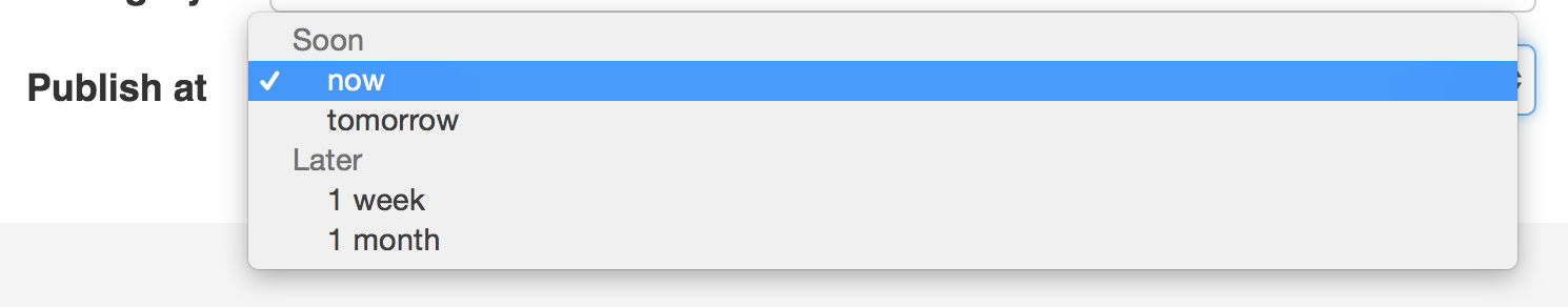
Take the following example:
use Symfony\Component\Form\Extension\Core\Type\ChoiceType;
// ...

$builder->add('publishAt', ChoiceType::class, [
    'choices' => [
        'now' => new \DateTime('now'),
        'tomorrow' => new \DateTime('+1 day'),
        '1 week' => new \DateTime('+1 week'),
        '1 month' => new \DateTime('+1 month'),
    ],
    'group_by' => function($choice, $key, $value) {
        if ($choice <= new \DateTime('+3 days')) {
            return 'Soon';
        }

        return 'Later';
    },
]);
This groups the dates that are within 3 days into “Soon” and everything else into
a “Later” <optgroup>:
If you return null, the option won’t be grouped. You can also pass a string
“property path” that will be called to get the group. See the choice_label for
details about using a property path.
Tip
When defining a custom type, you should use the
ChoiceList class helper:
use Symfony\Component\Form\ChoiceList\ChoiceList;

// ...
$builder->add('choices', ChoiceType::class, [
    'group_by' => ChoiceList::groupBy($this, 'category'),
]);
See the “choice_loader” option documentation.
multiple
type: boolean default: false
If true, the user will be able to select multiple options (as opposed
to choosing just one option). Depending on the value of the expanded
option, this will render either a select tag or checkboxes if true and
a select tag or radio buttons if false. The returned value will be an array.
Note
If you are working with a collection of Doctrine entities, it will be helpful to read the documentation for the CollectionType Field as well. In addition, there is a complete example in the How to Embed a Collection of Forms article.
placeholder
type: string or boolean
This option determines whether or not a special “empty” option (e.g. “Choose
an option”) will appear at the top of a select widget. This option only
applies if the multiple option is set to false.
Add an empty value with “Choose an option” as the text:
use Symfony\Component\Form\Extension\Core\Type\ChoiceType;
// ...

$builder->add('states', ChoiceType::class, [
    'placeholder' => 'Choose an option',
]);
Guarantee that no “empty” value option is displayed:
use Symfony\Component\Form\Extension\Core\Type\ChoiceType;
// ...

$builder->add('states', ChoiceType::class, [
    'placeholder' => false,
]);
If you leave the placeholder option unset, then a blank (with no text)
option will automatically be added if and only if the required option
is false:
use Symfony\Component\Form\Extension\Core\Type\ChoiceType;
// ...

// a blank (with no text) option will be added
$builder->add('states', ChoiceType::class, [
    'required' => false,
]);
preferred_choices
type: array or callable default: []
This option allows you to move certain choices to the top of your list with a visual separator between them and the rest of the options. This option expects an array of entity objects:
use App\Entity\User;
use Symfony\Bridge\Doctrine\Form\Type\EntityType;
// ...

$builder->add('users', EntityType::class, [
    'class' => User::class,
    // this method must return an array of User entities
    'preferred_choices' => $group->getPreferredUsers(),
]);
The preferred choices are only meaningful when rendering a select element
(i.e. expanded false). The preferred choices and normal choices are separated
visually by a set of dotted lines (i.e. -------------------). This can be customized
when rendering the field:
1 | {{ form_widget(form.publishAt, { 'separator': '=====' }) }}
|
translation_domain
type: string default: messages
In case choice_translation_domain is set to true or null, this
configures the exact translation domain that will be used for any labels or
options that are rendered for this field.
trim
type: boolean default: false
Trimming is disabled by default because the selected value or values must match the given choice values exactly (and they could contain whitespaces).
These options inherit from the form type:
attr
type: array default: []
If you want to add extra attributes to an HTML field representation
you can use the attr option. It’s an associative array with HTML attributes
as keys. This can be useful when you need to set a custom class for some widget:
$builder->add('body', TextareaType::class, [
    'attr' => ['class' => 'tinymce'],
]);
See also
Use the row_attr option if you want to add these attributes to the
the form type row element.
data
type: mixed default: Defaults to field of the underlying structure.
When you create a form, each field initially displays the value of the corresponding property of the form’s domain data (e.g. if you bind an object to the form). If you want to override this initial value for the form or an individual field, you can set it in the data option:
use Symfony\Component\Form\Extension\Core\Type\HiddenType;
// ...

$builder->add('token', HiddenType::class, [
    'data' => 'abcdef',
]);
Caution
The data option always overrides the value taken from the domain data
(object) when rendering. This means the object value is also overridden when
the form edits an already persisted object, causing it to lose its
persisted value when the form is submitted.
disabled
type: boolean default: false
If you don’t want a user to modify the value of a field, you can set the disabled option to true. Any submitted value will be ignored.
empty_data
type: mixed
The actual default value of this option depends on other field options:
- If
multipleisfalseandexpandedisfalse, then''(empty string); - Otherwise
[](empty array).
This option determines what value the field will return when the submitted value is empty (or missing). It does not set an initial value if none is provided when the form is rendered in a view.
This means it helps you handling form submission with blank fields. For
example, if you want the name field to be explicitly set to John Doe
when no value is selected, you can do it like this:
$builder->add('name', null, [
    'required'   => false,
    'empty_data' => 'John Doe',
]);
This will still render an empty text box, but upon submission the John Doe
value will be set. Use the data or placeholder options to show this
initial value in the rendered form.
If a form is compound, you can set empty_data as an array, object or
closure. See the How to Configure empty Data for a Form Class article for more details about
these options.
Note
If you want to set the empty_data option for your entire form class,
see the How to Configure empty Data for a Form Class article.
Caution
Form data transformers will still be
applied to the empty_data value. This means that an empty string will
be cast to null. Use a custom data transformer if you explicitly want
to return the empty string.
error_bubbling
type: boolean default: false unless the form is compound
If true, any errors for this field will be passed to the parent field
or form. For example, if set to true on a normal field, any errors for
that field will be attached to the main form, not to the specific field.
error_mapping
type: array default: []
This option allows you to modify the target of a validation error.
Imagine you have a custom method named matchingCityAndZipCode() that validates
whether the city and zip code match. Unfortunately, there is no matchingCityAndZipCode
field in your form, so all that Symfony can do is display the error on top
of the form.
With customized error mapping, you can do better: map the error to the city field so that it displays above it:
public function configureOptions(OptionsResolver $resolver)
{
    $resolver->setDefaults([
        'error_mapping' => [
            'matchingCityAndZipCode' => 'city',
        ],
    ]);
}
Here are the rules for the left and the right side of the mapping:
- The left side contains property paths;
- If the violation is generated on a property or method of a class, its
path is the
propertyName; - If the violation is generated on an entry of an
arrayorArrayAccessobject, the property path is[indexName]; - You can construct nested property paths by concatenating them, separating
properties by dots. For example:
addresses[work].matchingCityAndZipCode; - The right side contains the names of fields in the form.
By default, errors for any property that is not mapped will bubble up to the
parent form. You can use the dot (.) on the left side to map errors of all
unmapped properties to a particular field. For instance, to map all these
errors to the city field, use:
$resolver->setDefaults([
    'error_mapping' => [
        '.' => 'city',
    ],
]);
help
type: string default: null
Allows you to define a help message for the form field, which by default is rendered below the field:
$builder->add('zipCode', null, [
    'help' => 'The ZIP/Postal code for your credit card\'s billing address.',
]);
help_attr
type: array default: []
Sets the HTML attributes for the element used to display the help message of the form field. Its value is an associative array with HTML attribute names as keys. These attributes can also be set in the template:
1 2 3 | {{ form_help(form.name, 'Your name', {
'help_attr': {'class': 'CUSTOM_LABEL_CLASS'}
}) }}
|
help_html
type: bool default: false
By default, the contents of the help option are escaped before rendering
them in the template. Set this option to true to not escape them, which is
useful when the help contains HTML elements.
label
type: string default: The label is “guessed” from the field name
Sets the label that will be used when rendering the field. Setting to false will suppress the label. The label can also be directly set inside the template:
- Twig
1
{{ form_label(form.name, 'Your name') }}
- PHP
1
2
3
4
echo $view['form']->label(
    $form['name'],
    'Your name'
);
label_attr
type: array default: []
Sets the HTML attributes for the <label> element, which will be used
when rendering the label for the field. It’s an associative array with HTML
attribute as a key. This attributes can also be directly set inside the
template:
- Twig
1
2
3
{{ form_label(form.name, 'Your name', {
    'label_attr': {'class': 'CUSTOM_LABEL_CLASS'}
}) }}
- PHP
1
2
3
4
5
echo $view['form']->label(
    $form['name'],
    'Your name',
    ['label_attr' => ['class' => 'CUSTOM_LABEL_CLASS']]
);
label_format
type: string default: null
Configures the string used as the label of the field, in case the label
option was not set. This is useful when using
keyword translation messages.
If you’re using keyword translation messages as labels, you often end up having
multiple keyword messages for the same label (e.g. profile_address_street,
invoice_address_street). This is because the label is built for each “path”
to a field. To avoid duplicated keyword messages, you can configure the label
format to a static value, like:
// ...
$profileFormBuilder->add('address', AddressType::class, [
    'label_format' => 'form.address.%name%',
]);

$invoiceFormBuilder->add('invoice', AddressType::class, [
    'label_format' => 'form.address.%name%',
]);
This option is inherited by the child types. With the code above, the label of
the street field of both forms will use the form.address.street keyword
message.
Two variables are available in the label format:
%id%- A unique identifier for the field, consisting of the complete path to the
field and the field name (e.g.
profile_address_street); %name%- The field name (e.g.
street).
The default value (null) results in a
“humanized” version of the field name.
Note
The label_format option is evaluated in the form theme. Make sure to
update your templates in case you
customized form theming.
mapped
type: boolean default: true
If you wish the field to be ignored when reading or writing to the object,
you can set the mapped option to false.
required
type: boolean default: true
If true, an HTML5 required attribute will be rendered. The corresponding
label will also render with a required class.
This is superficial and independent of validation. At best, if you let Symfony guess your field type, then the value of this option will be guessed from your validation information.
Note
The required option also affects how empty data for each field is handled. For more details, see the empty_data option.
row_attr
type: array default: []
An associative array of the HTML attributes added to the element which is used to render the form type row:
$builder->add('body', TextareaType::class, [
    'row_attr' => ['class' => 'text-editor', 'id' => '...'],
]);
See also
Use the attr option if you want to add these attributes to the
the form type widget element.
label_translation_parameters
type: array default: []
The content of the label option is translated before displaying it, so it can contain translation placeholders. This option defines the values used to replace those placeholders.
Given this translation message:
1 2 | # translations/messages.en.yaml
form.order.id: 'Identifier of the order to %company%'
|
You can specify the placeholder values as follows:
$builder->add('id', null, [
    'label' => 'form.order.id',
    'label_translation_parameters' => [
        '%company%' => 'ACME Inc.',
    ],
]);
The label_translation_parameters option of children fields is merged with
the same option of their parents, so children can reuse and/or override any of
the parent placeholders.
attr_translation_parameters
type: array default: []
The content of the title and placeholder values defined in the attr
option is translated before displaying it, so it can contain
translation placeholders. This
option defines the values used to replace those placeholders.
Given this translation message:
1 2 3 | # translations/messages.en.yaml
form.order.id.placeholder: 'Enter unique identifier of the order to %company%'
form.order.id.title: 'This will be the reference in communications with %company%'
|
You can specify the placeholder values as follows:
$builder->add('id', null, [
    'attr' => [
        'placeholder' => 'form.order.id.placeholder',
        'title' => 'form.order.id.title',
    ],
    'attr_translation_parameters' => [
        '%company%' => 'ACME Inc.',
    ],
]);
The attr_translation_parameters option of children fields is merged with the
same option of their parents, so children can reuse and/or override any of the
parent placeholders.
help_translation_parameters
type: array default: []
The content of the help option is translated before displaying it, so it can contain translation placeholders. This option defines the values used to replace those placeholders.
Given this translation message:
1 2 | # translations/messages.en.yaml
form.order.id.help: 'This will be the reference in communications with %company%'
|
You can specify the placeholder values as follows:
$builder->add('id', null, [
    'help' => 'form.order.id.help',
    'help_translation_parameters' => [
        '%company%' => 'ACME Inc.',
    ],
]);
The help_translation_parameters option of children fields is merged with the
same option of their parents, so children can reuse and/or override any of the
parent placeholders.